
Campaigns that actually mean something, built on real strategy

Visual direction with a purpose. For founders and creative leaders who know the standard playbook doesn't cut it.
A lot of agencies hand over some mood boards and call that strategy. We don't do that. We start by mapping out the actual architecture of your campaign—the color systems, how your story gets told, the visual hierarchy that ties everything together. That framework runs through everything you make, from your social feed to your brand identity. Your visual identity shouldn't just stand out. It should tell people why you exist and what you do in a way that actually stays with them.
What we actually deliver
Five things that separate strategy from wallpaper.
Campaign frameworks that hold weight
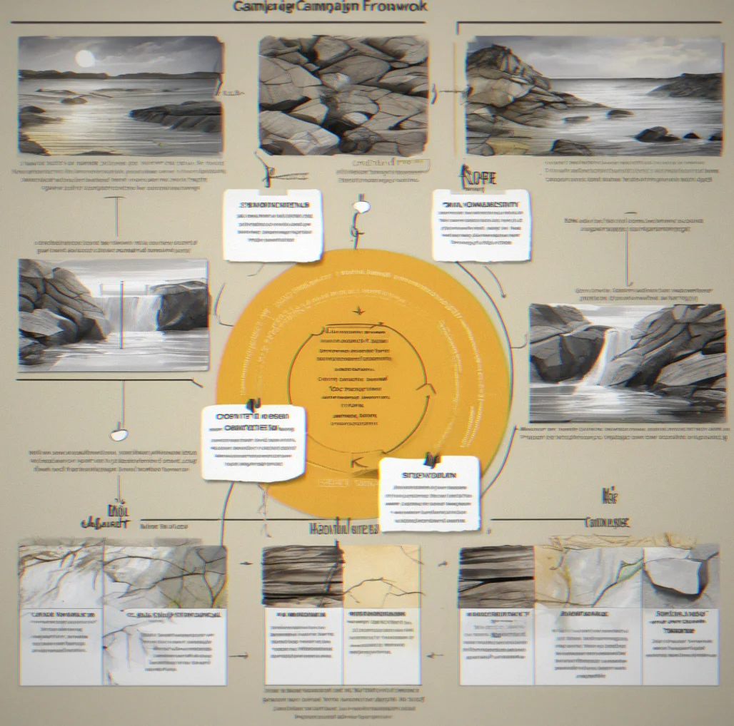
A mood board is just decoration. We map out narrative structure, visual hierarchy, and tone across every channel before anyone starts designing anything. So your social posts, emails, and landing pages all sound like the same brand without feeling like they came off an assembly line.
Color systems, not color palettes
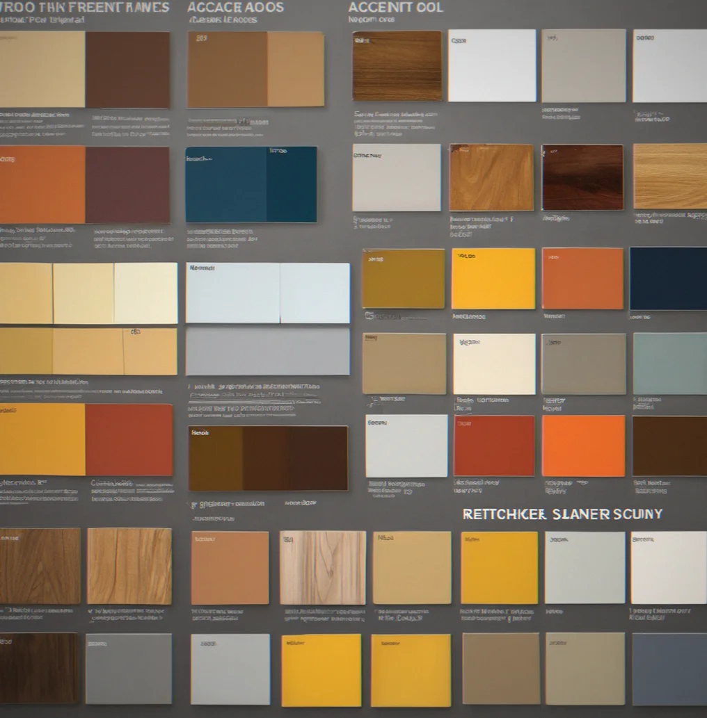
A palette is five colors that happen to look good together. A syztem is thought through—primaries for hierarchy, accents for emphasis, neutrals that actually work in product interfaces. Each color choice has to tie back to your brand logic.
Strategic briefs that inform execution
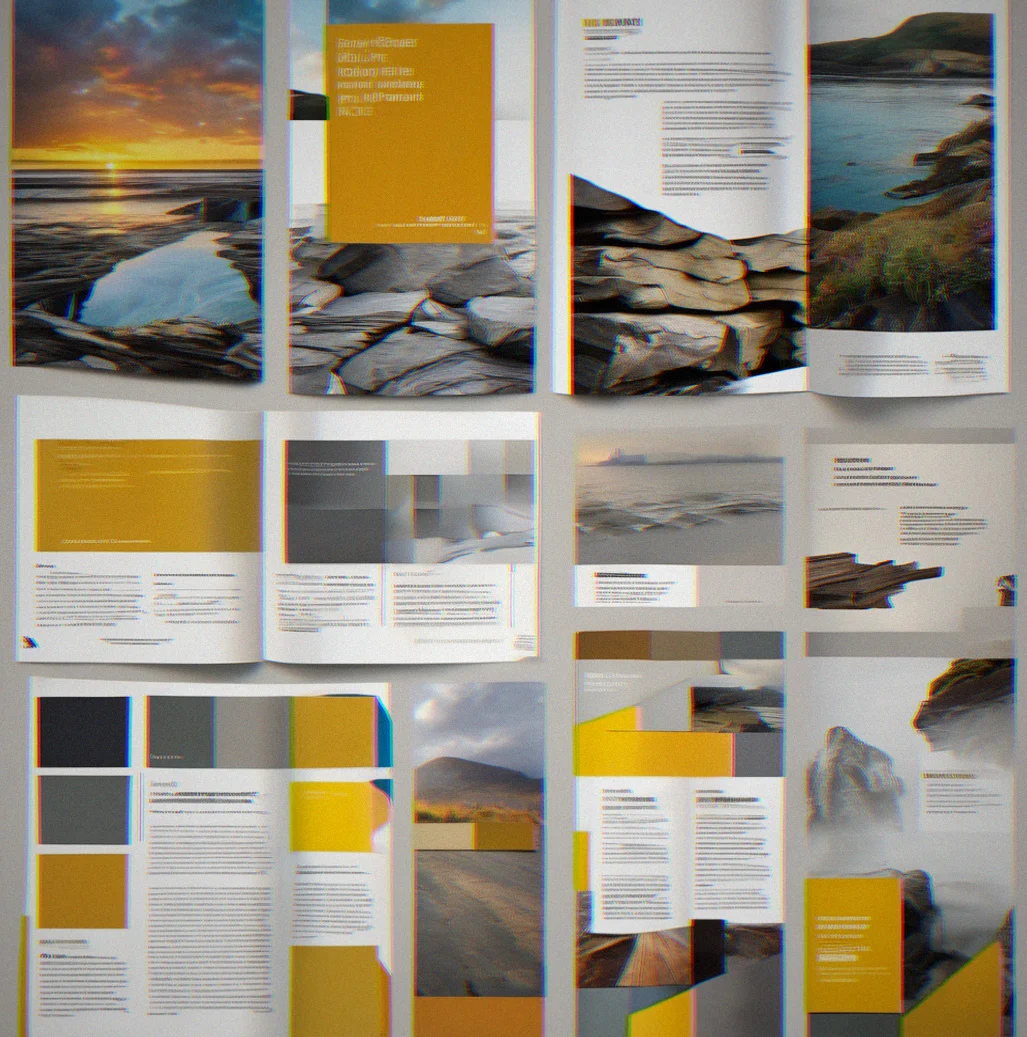
Your designers need to know *why* before they pick a font. We write briefs that lay out campaign intent, audience psychology, what competitors are doing, and what visual moves make sense. Then every paid ad, piece of content, and identity asset actually has direction instead of just looking cool.
Mood boards that aren't Pinterest
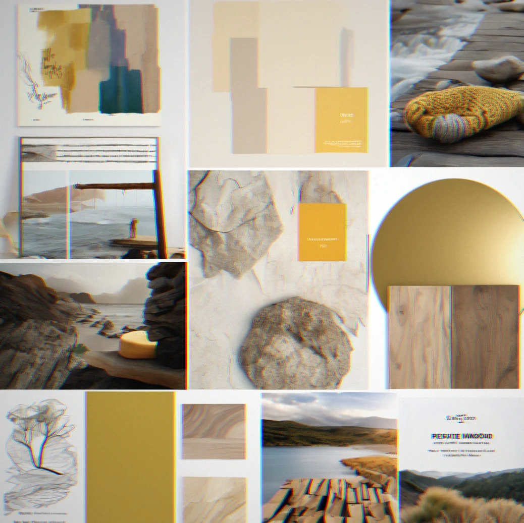
Real mood boards show systems, not just vibes. We pull existing work that demonstrates color relationships, shows typography in use, identifies pacing and rhythm. Every image in there teaches you something.
Identity that scales across channels
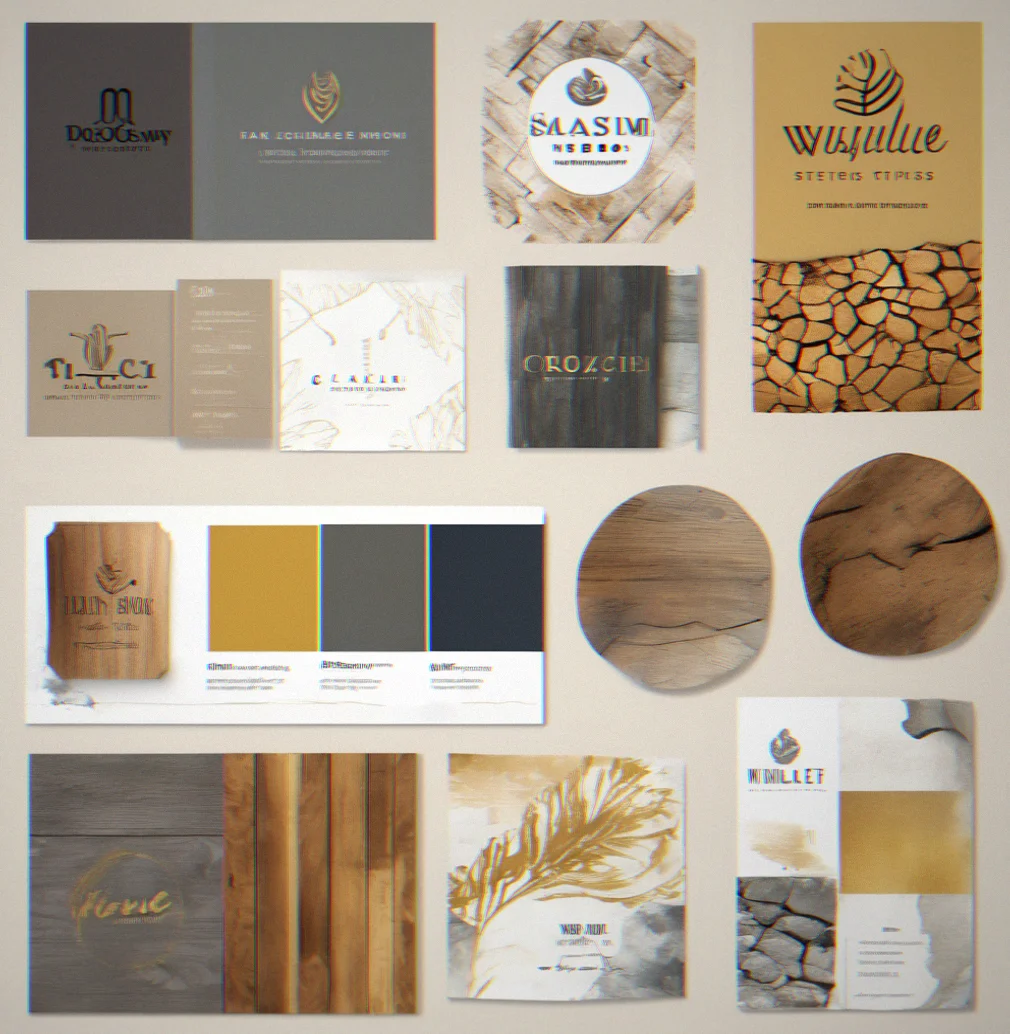
Your logo needs to work on a business card and a billboard, sure. But real identity work means your visual language doesn't break when it hits social thumbnails, dark mode, video covers, or whatever new platform launches next.
How we work differently
Seven things that happen before we touch design.
Strategy first, aesthetics second
We tie business goals directly to visual decisions. Every color, typeface and layout call connects to something you can actually measure — whether that's how many people convert, how well they remember your brand, or where you sit in the market.
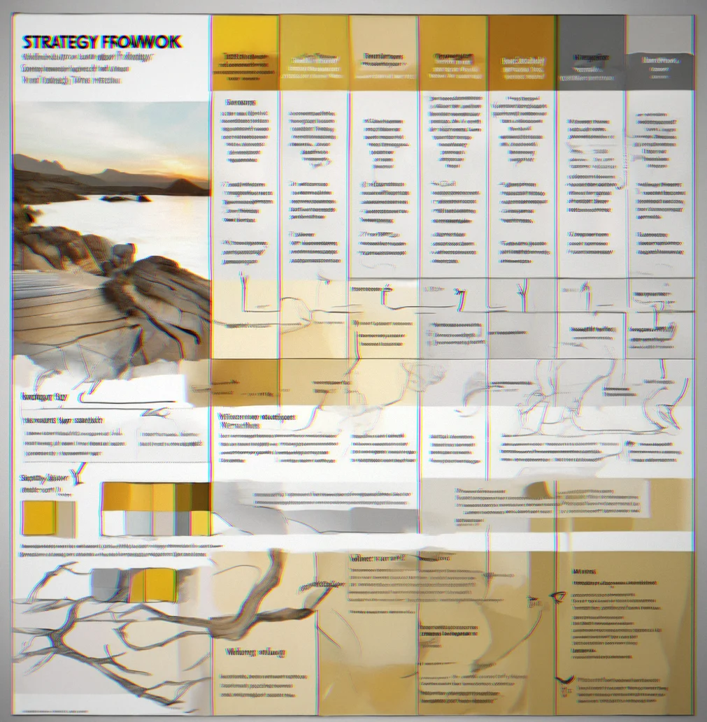
Campaign architecture, not mood board decoration
We build out how your visual language works across email, social, paid ads, and your product itself. Your team gets something they can actually run with instead of a nice-looking PDF that ends up forgotten in Slack.
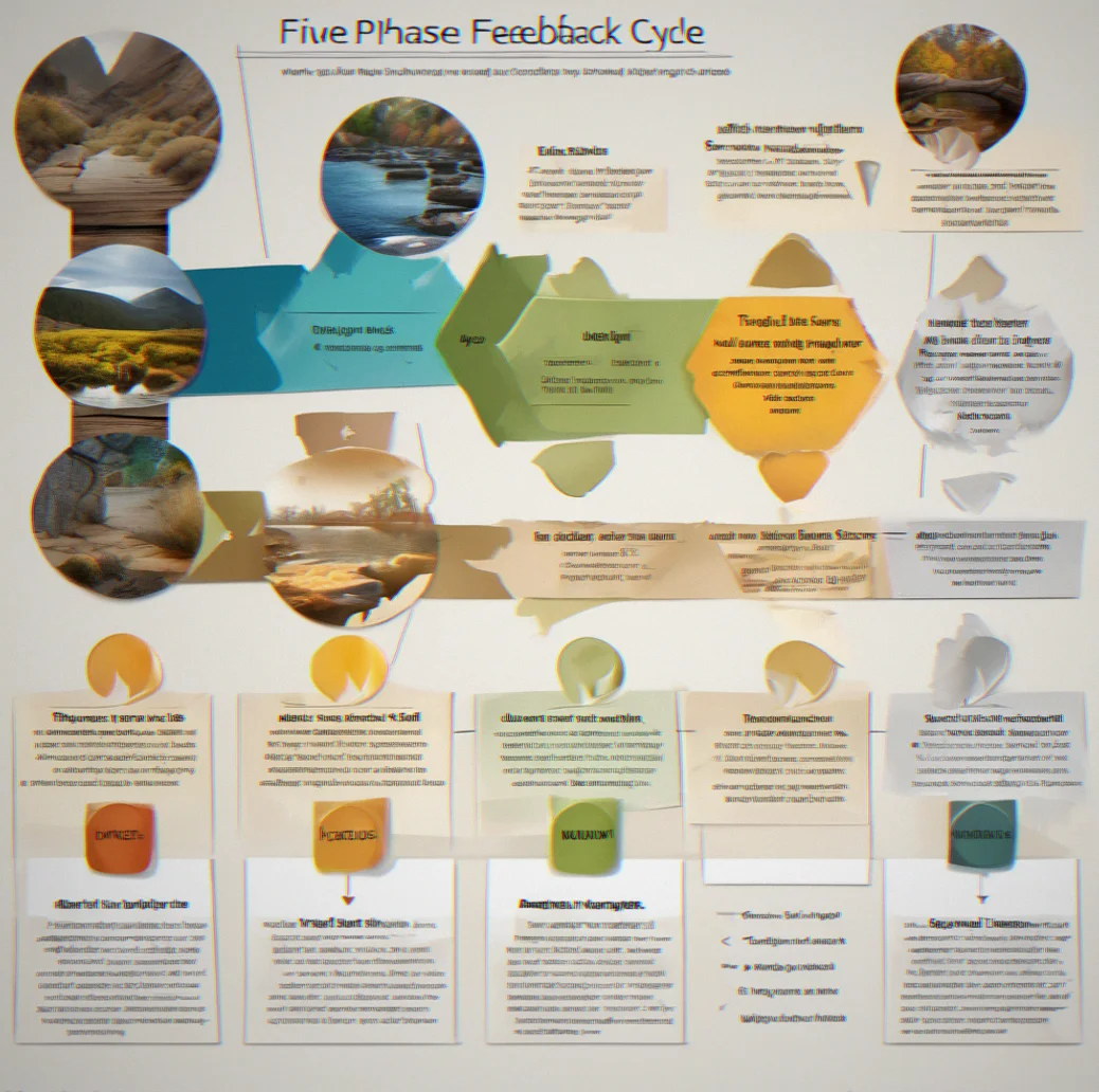
5 rounds of feedback baked in
Not endless back-and-forth. You see work at five clear moments, give feedback, we refine. It's bounded. No scope creep sneaking in. Everyone's on the same page about what's actually happening.
Color systems with reasoning attached
You don't just get colors. You get why that accent orange works for emphasis, how your neutrals look in dark mode, the whole logic behind it. We write it down so your team can build on it without making stuff up.

Competitive context you actually understand
We map what's already out there in your space — not so you can copy it, but so you can see the gap. Where everyone's clustering. Where there's room for you to stand out. Visual strategy is really about finding that distance between you and the rest.
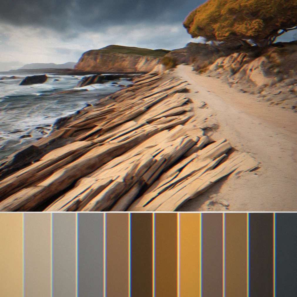
Briefs that your team will actually read
These are written for people who need to do the work, not for a filing cabinet. We explain what we're after, show real examples and trust your designers to think. It's flexible but directional — something to reference when they're sweating the small stuff.
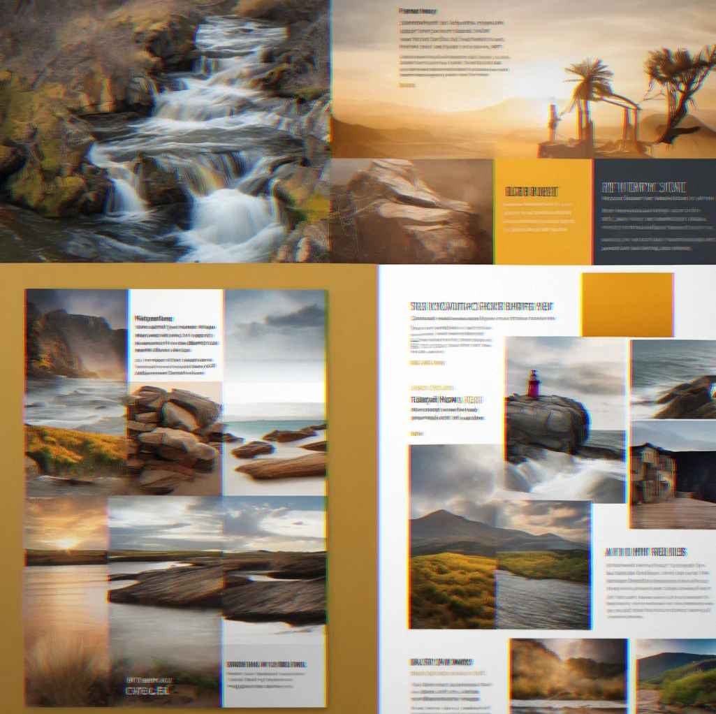
Deliverables that scale across platforms
A logo by itself is just one thing. Real identity work means your visual language holds up when it's tiny, when it's dark mode, in video thumbnails and whatever new format shows up next year. Built to stretch.
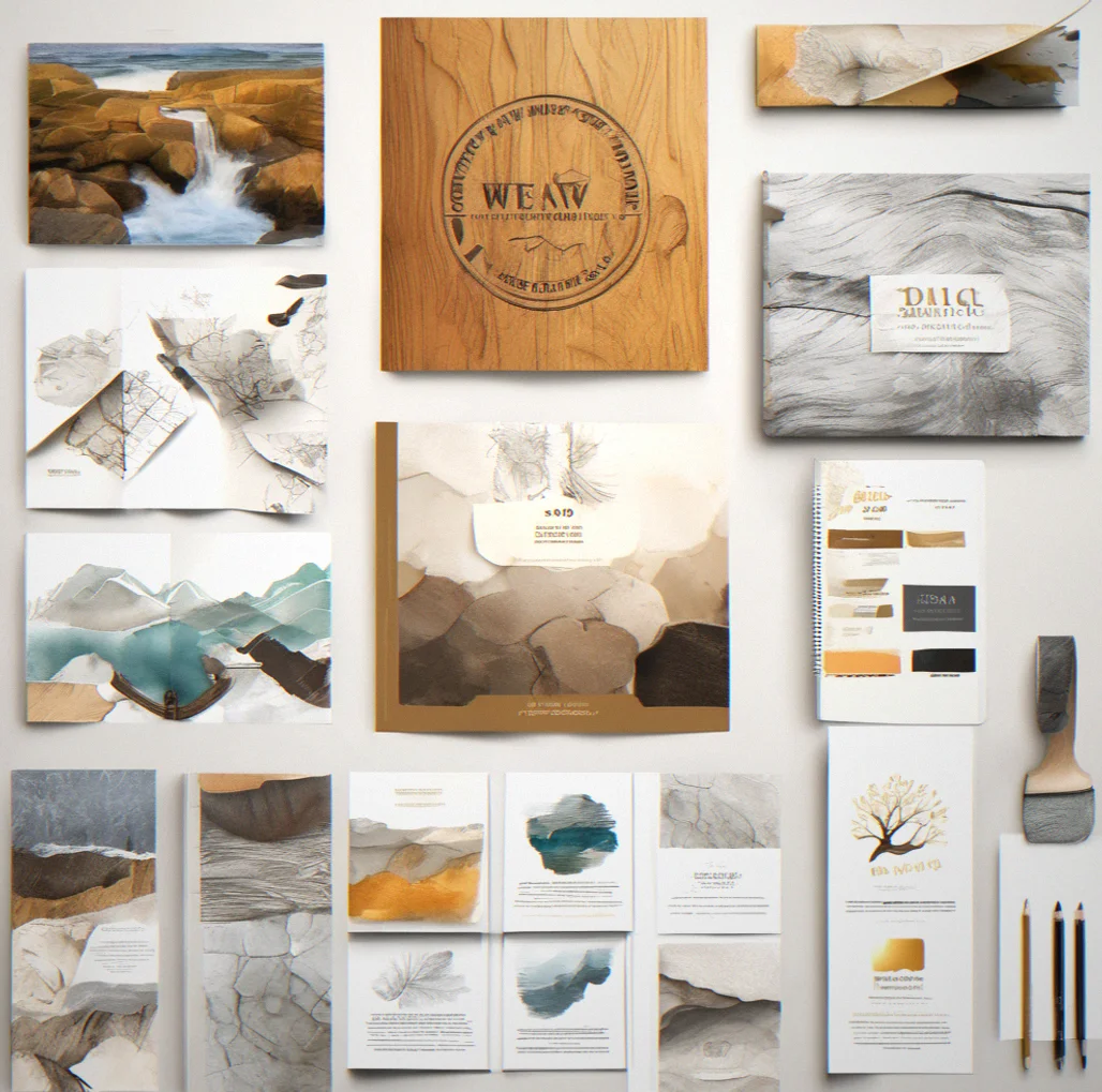
How visual strategy actually works
Map your audience first
Who are you actually talking to? Not some vauge demographic. Real people. How they behave. What catches their eye and what they ignore. Everything you design visually has to fit inside that picture.
Find your competitive angle
Look at twenty brands doing what you do. See what they all have in common visually. Then find the small shift that's only yours. That's your strategy. Not a trend, not something that just looks nice. A real position.
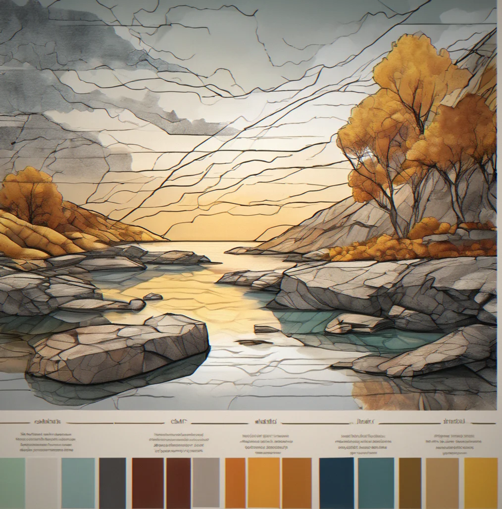
Build your visual story
What does your brand actually do? What problem does it solve? That translates into visual decisions. Color warmth. Font weight. How you treat images. Pacing. The story comes first and the look follows from it.
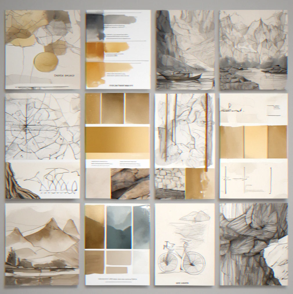
Design a working color palette
Five colors. One primary that builds trust and shows hierarchy. One secondary that gives you room to work. Accents to call attention. Neutrals that hold up everywhere—websites, printed stuff, dark mode. Everg color has a purpose.
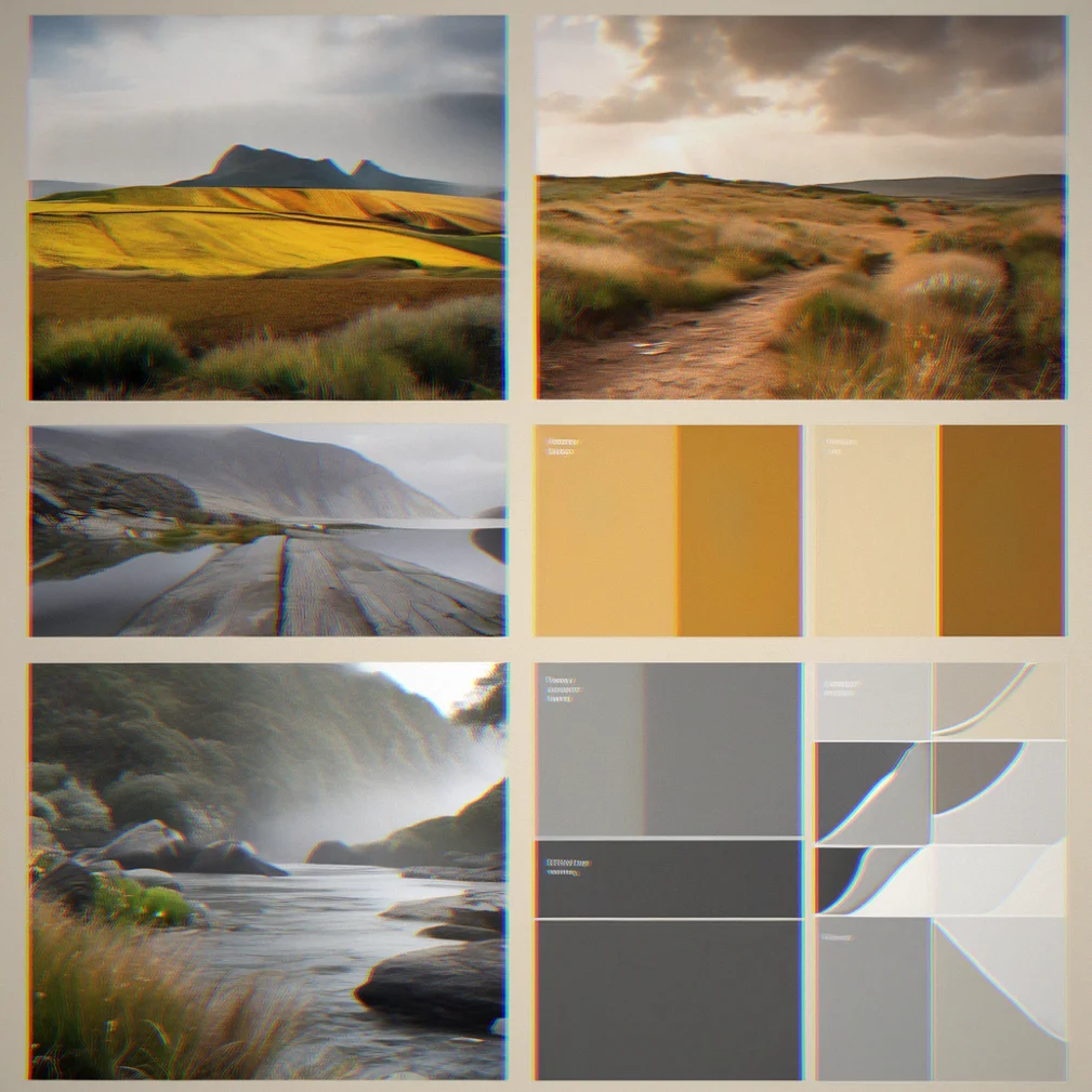
Use typography for structure
Two fonts, maximum. Headlines get one, body text gets the other. Weight and size and spacing do the work, not decoration.
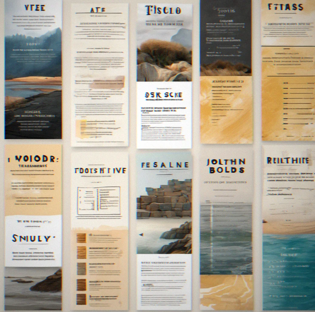
Plan for every channel
Show how your visuals work across email, social posts, ads, your app and printed materials. Same idea, different shapes for each place. Your team gets a system to follow instead of making it up each time. That's how you stay consistent without being rigid.
Write a real brief
Designers need to know why they're making these choices, not just what to make. Explain the thinking, the situation, where you stand against competitors, and what you're deliberately not doing. Let them understand the goal.
Check it everywhere
Does your logo still look like your logo at tiny sizes? How does your color scheme look on a phone screen? What about dark mode? Don't leave these questions for later.
Make it work for the future
Your brand doesn't stop after today. Write it down in a way that lets people add new colors or new patterns or new uses without breaking what you built. It should grow.
Work in progress
Strategy documents, color systems, campaign briefs — the actual thinking that sits behind every visual direction we deliver. Not the polished final work. The stuff that actually matters.
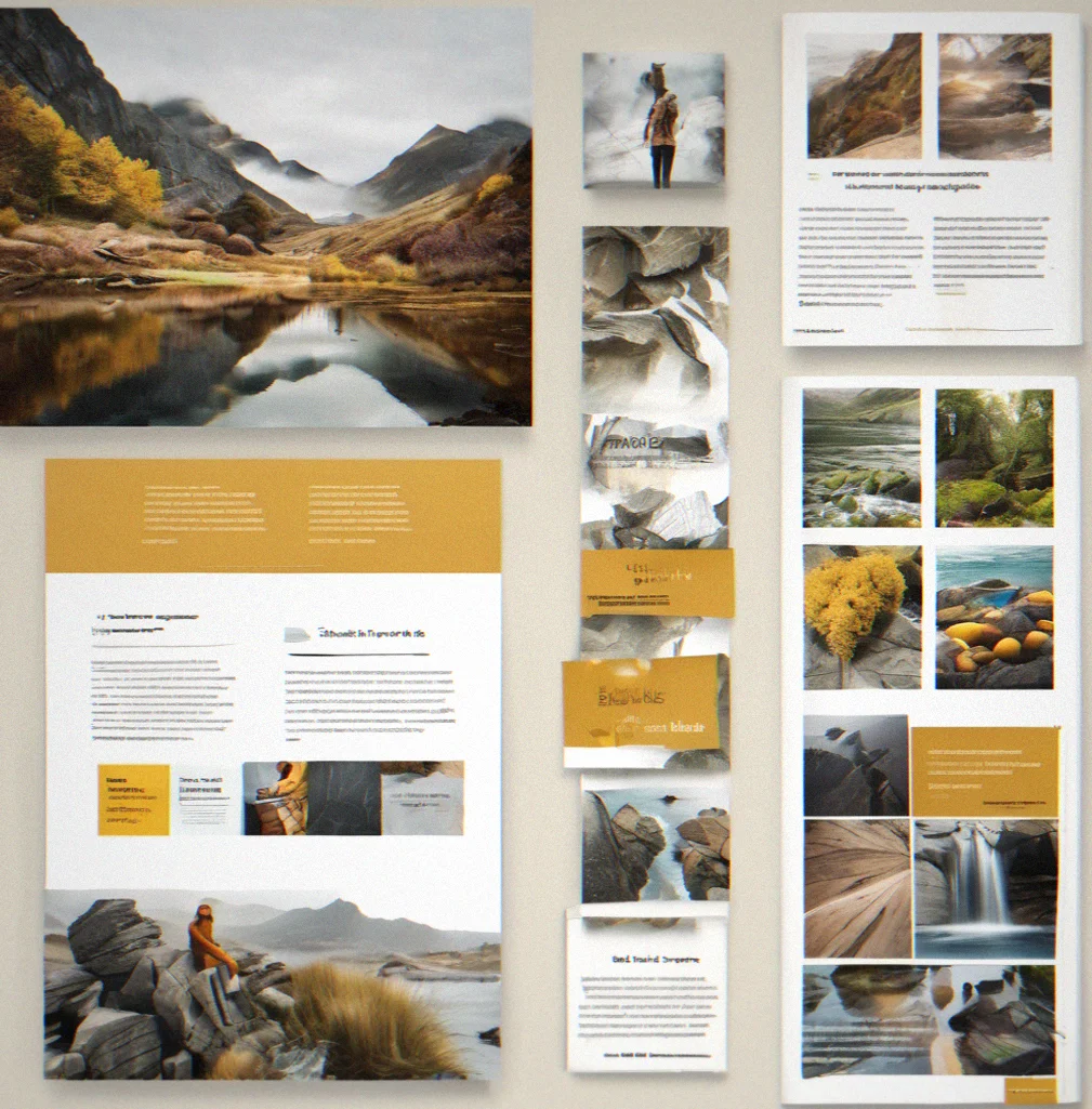
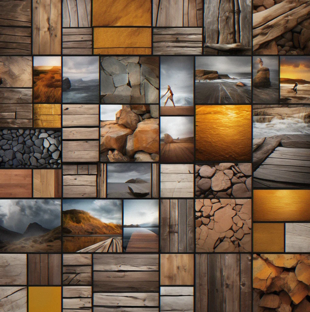
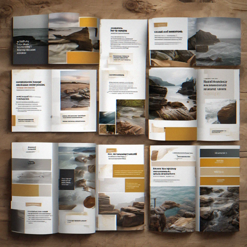
Campaign framework showing how visual hierarchy, coolors and type scale work across email and social
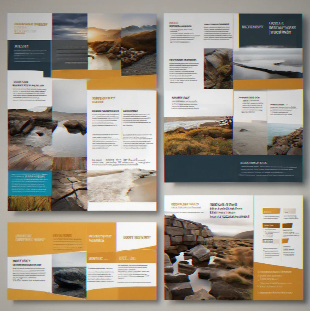
Strategic brief mapping out competitors, what the audience actually wants, and the visual rules we're working within
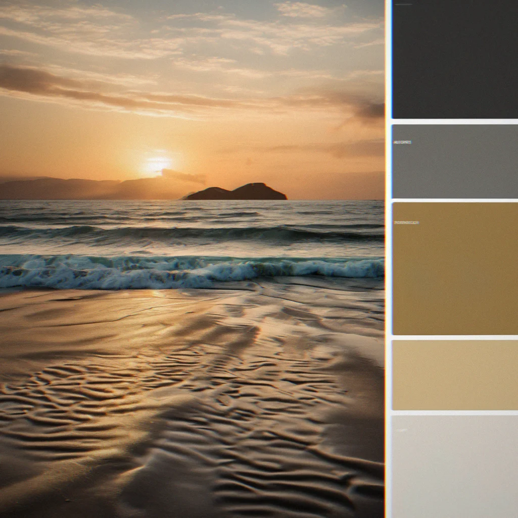
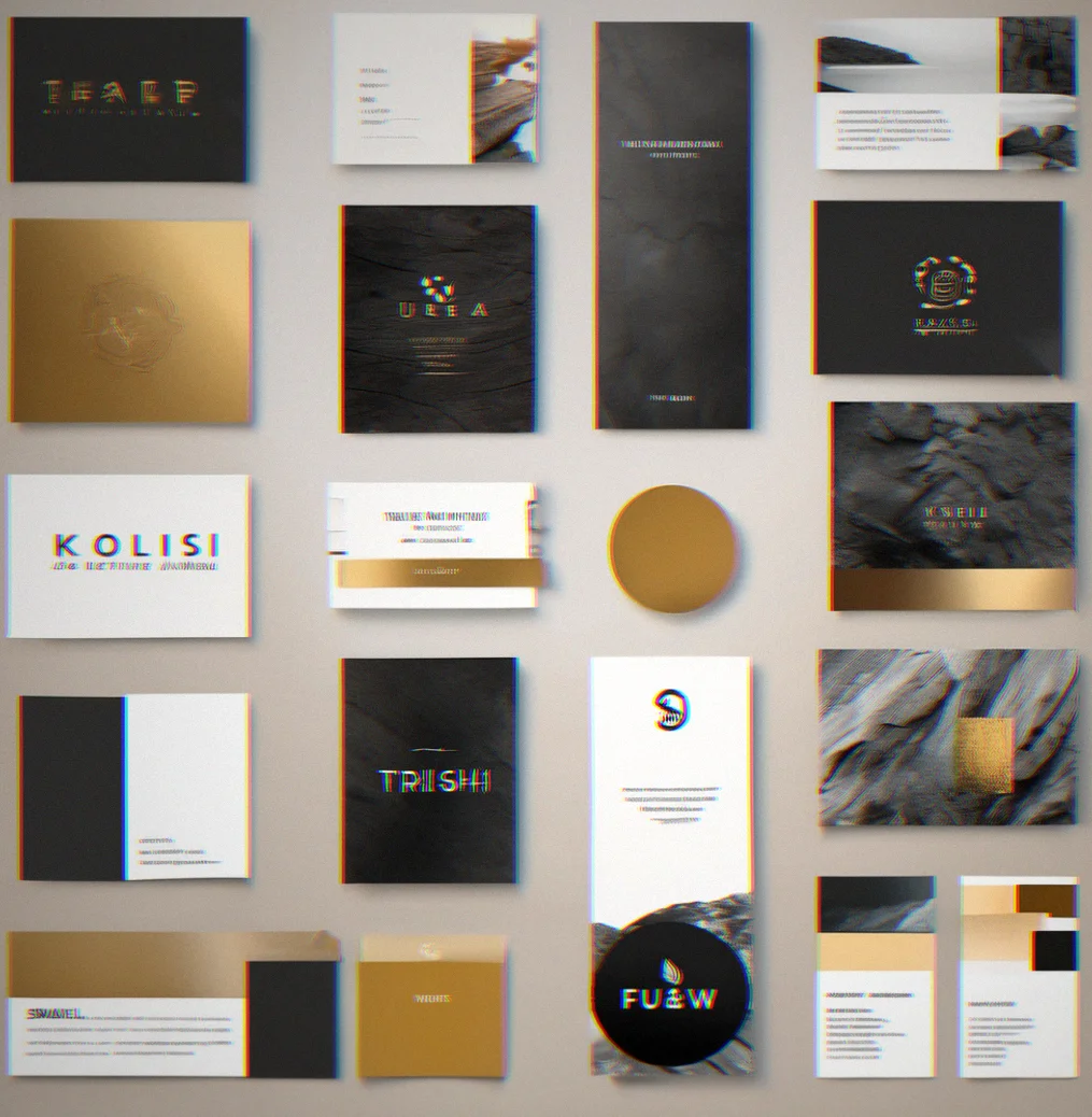
Color palette with primary, secondary and accent options, contrast checks and how it looks in dark mode
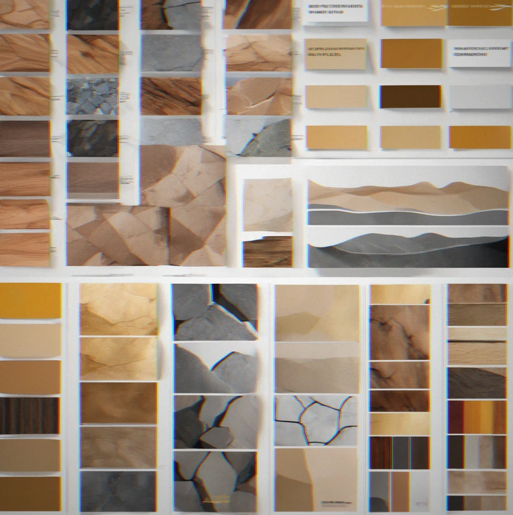
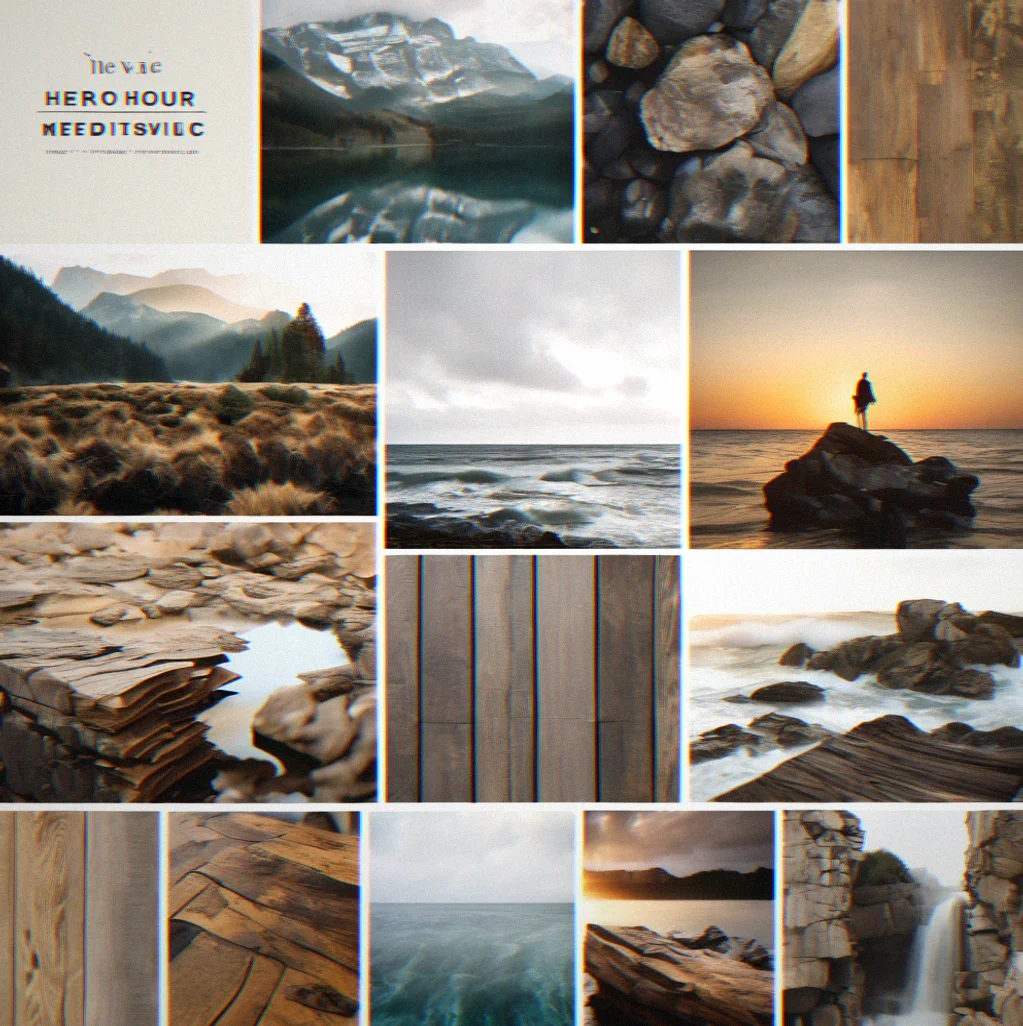
Mood board pulling together visual references, type choices, and the story we're trying to tell with the brand
Common concerns
Strategy work isn't mysterious. Here's what actually happens, what it costs, and whether it fits your timeline.
Six to eight weeks from start to finish. That covers audience research, competitive mapping, framework development, five rounds of feedback, and documentation. Want it faster? Four weeks is doable but you'll need to cut scope.
Strategic brief, campaign framework, color system with usage rules, typography hierarchy, and a mood board that references real systems instead of vibes. The mood board comes last. Everything before it is actual thinking.
Depends on what's broken. Visual language problems—color, typography, imagery—that's a four-week sprint. Positioning or audience fit issues mean the strategy piece comes first, then visual work. We figure out what needs fixing before we quote you.
We deliver strategy and direction. Your team can execute it or you bring in someone else. The brief we write is clear enough that the execution doesn't need us there.
Two rounds of substantial revision are included. Beyond that, changes push the timeline and the fee. Scope creep kills this kind of work faster than anything.
Depends on your funding and whether visual positioning actually matters for your launch. Selling B2B SaaS to enterprises? Yes—identity affects deal flow. Pre-revenue and still figuring out product-market fit? Probably not the right time yet.
Get strategy thinking delivered twice a month
Campaign frameworks, how we think through color systems, what competitors are doing, and the reasoning that actually shapes visual strategy. No templates or trend-chasing here—just real, usable direction.
We dig into what actually matters for founders and creative directors making brands that stand out from the crowd.
You're in.
Look for a confirmation email. The first issue goes out July 22nd.